Map Of The Ninja
I’ve been meaning for a long time to write about how I did some of the things that went into Mark of the Ninja, and since somebody asked about the map rendering on twitter, it’s as good a time as any. There isn’t much to tell, it’s done in a very simple way, but I was ultimately quite happy with how it turned out. It was potentially one of the very first real rendering tasks that I did on the job as a game developer, so there was a lot of learning for me while I was working on it.
This was how the first version of the map looked:
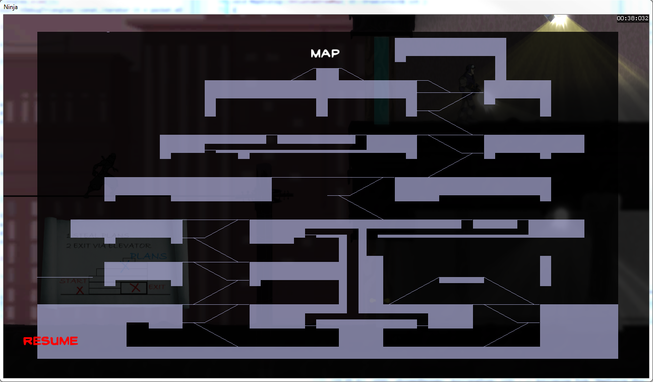
At Klei everyone contributes to the design of the games we work on, and chances are if you’re implementing a feature you’re also designing it at least partially, and maybe entirely. The look of the map was something I proposed and implemented, with Jeff our art director creating the textures.
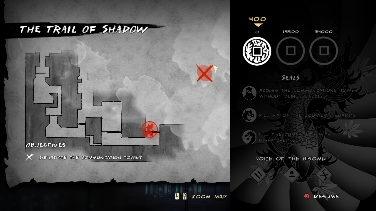
This is how it looked in the final product:
Geometry
Mark of the Ninja’s engine was based on the same engine as Shank 2, and our level editor was called Shanker. Shanker output the level geometry as a list of line segments defining all of the platforms, ledges and walls of the game. In order to draw the map, we took that data and fed it through Triangle a free tool for generating high quality 2D triangle meshes. The result of that process was something like this:
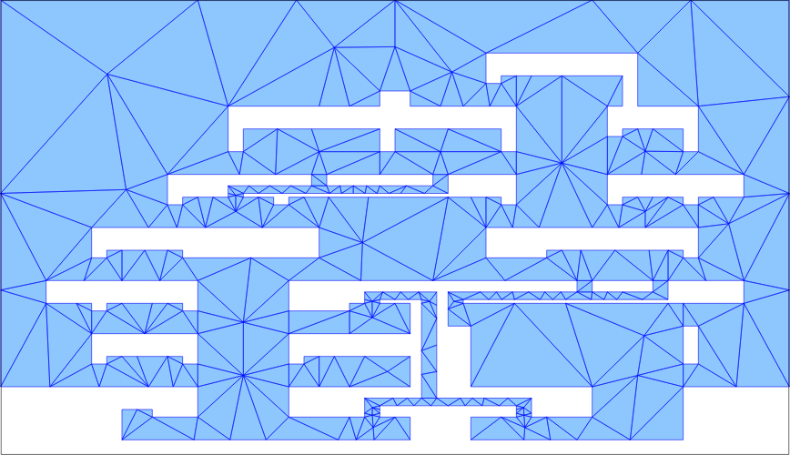
This image is actually of the negative space of the level, used for audio pathfinding. The inverse of this mesh would be used for drawing the map.
This is enough to get you to the Version 1.0 image above.
Fill
The next step is just adding a tiled paper texture to the background, and similarly an inked paper texture on triangles we got from the output of Shanker representing the level geometry.
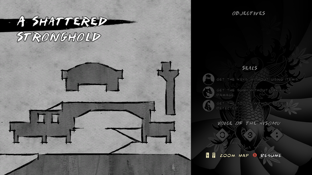
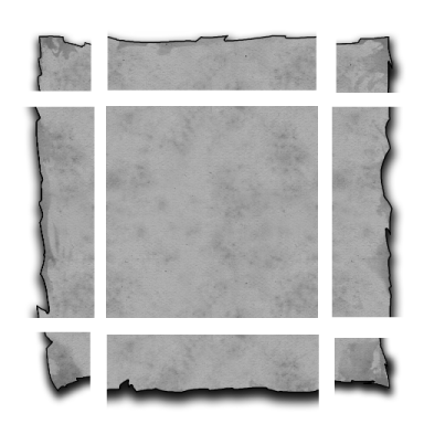
There was a tilable border around the edges to make it all look like a large sheet of paper or canvas.
Brush Strokes
Just using plain geometry result in hard edges between the inked and plain paper areas, so we masked that with brush stroke textures. These were applied around all of the line segments making up the level geometry, as well as the lines which defined ramps, catwalks, etc… (also exported from Shanker).
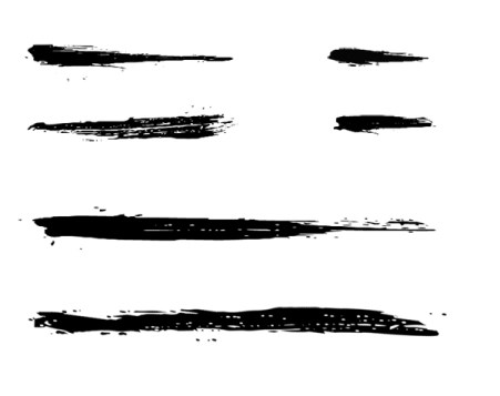
Again, this was super simple: we had a small set of several brush stroke textures of varying lengths. Looping over the list of line segments in the map, we chose a brush stroke texture based on whichever was the closest size to the line segment we were drawing and simply drew a textured quad over the line segment, stretching it to fit. Because the look we’re going for was specifically hand drawn, it worked in our favour to have the textures overlap a bit, and uneven stretching in this case added some desirable variation.
Exploration
Like many games, we don’t want you to be able to see parts of the map that you haven’t explored yet. Instead of covering them up, we “erased” them (by repainting over with the same tiled paper texture used on the background).
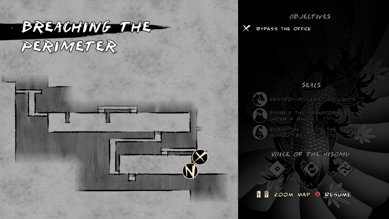
The game tracks what you’ve seen basically with a big grid covering the whole level. When you’ve seen a block of the grid, it’s marked as seen. When we render the map, we simply generate a grid of triangles, setting the alpha value of each vertex to 0 if you’ve seen that tile, or 1 if you haven’t. Interpolation takes care of the rest and gives us the gradient fade on the edges.
Splats
The map is still a bit bland and geometric, it would be nice to add some grunge to it to re-enforce the hand-drawn look. Enter splats.
These actually serve a second purpose, which is to give you a hint where you could possibly explore to. The splats are only drawn where there is level geometry, so you can get a sense of the overall shape of the level, without any of the details unless you explore them yourself.
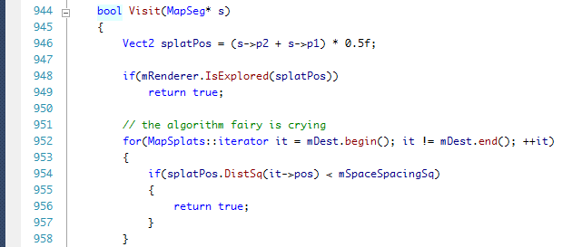
It’s ok to write terrible code as long as you admit to it with a funny comment.
To render the splats, we loop again over the line segments in the level, but this time instead of drawing them, we check to see if they are hidden in the exploration grid. If they are, we choose one splat texture from random and splat it onto the screen (hence the name). We also check to make sure that the splat we want to draw is at least some minimum distance from the last one, to keep a sensible number of them.
This brings us back to the final image, which I think is a reasonably passable hand drawn map:

I took most of these screenshots as I was working on this feature, because I was having fun doing it and I planned to write a little post about how it was done. It only took me 4 years to get around to it.
If you’re curious (and own Mark of the Ninja on PC/OSX/Linux) you can read the Lua file that defines the list of textures to use while rendering the map in Steam\steamapps\common\mark_of_the_ninja\data\uiconfig.lua