Draw A Manga Page Every Week Challenge - Week #1
What
I decided that to improve my drawing/illustration skills I would try producing a manga page every week this year.
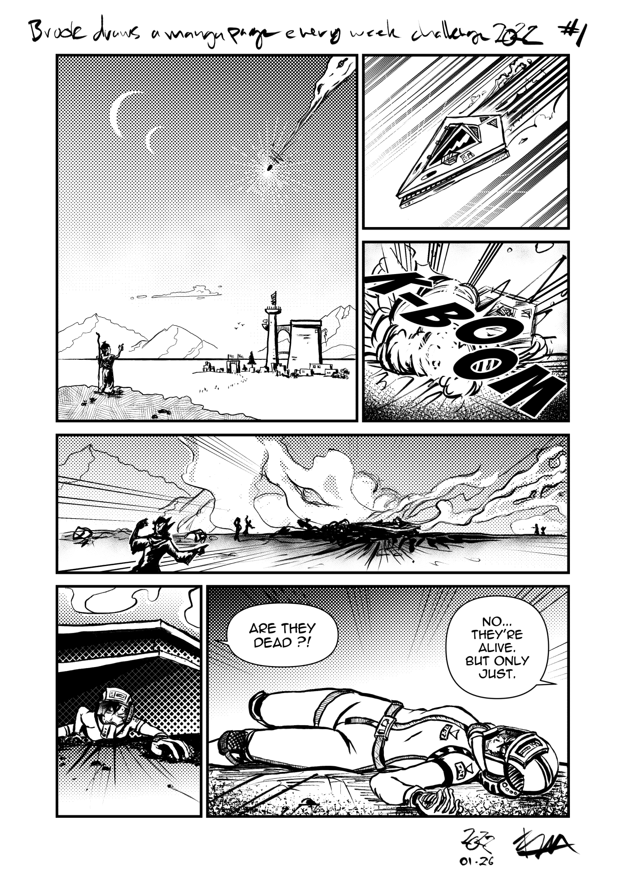
Here's the first page!
Why
Wanting to improve my art skills has been a running goal for me for a very long time (25 years give or take), and every once in a while I put in some effort, but am rarely able to sustain it, usually because other projects (like work) take priority over the time and energy that I would spend on art.
As I reflected during the new year on what I had accomplished in 2021, I realized that the idea of not being a game developer, no longer made me feel anxious or that I wasn’t being productive enough. Maybe it was ok to do something else for a while.
I had been toying around with some manga story ideas in my head, but still feel quite a ways away from being able to actually create them to the level that I can be happy with. Perhaps if I put in a year’s worth of effort, I can approach the level of skill needed to make a solid go of it?
As much as I see the value in gesture drawing, anatomy study, figure drawing and so on… on their own they’re not very motivating. I’m not confident that I can just “study art” for a year and actually stay dedicated long enough to see it through to the end. I don’t dream of gesture drawing, I imagine the stories (or fragments of stories) that I’d like to be able to put down on the page.
It occurred to me that I could just … do that. If I made one page per week, that’s 52 attempts and opportunities to learn from each one. I’ll probably get better after that, right?
The Challenge
Create one page of manga artwork each week.
- Storyboard out one page
- Complete that page to the best of my ability in that week
- Pages don’t need to be related to each other or fit together into a whole story, I don’t want to get bogged down by plot details
- The writing isn’t too important, it can just be a single stand-alone scene or moment
- “Each week” is approximate, if it ends up taking a bit longer that’s ok, and if I can finish a page sooner that’s great! The effort required per page will vary depending on the exact subject matter and how familiar I am with it.
Page #1 In Review
It took 12 days instead of 7 and, while I didn’t keep track, I’d estimate I spent somewhere in the order of 20-25 hours over that time.
I’m pretty happy with how page #1 turned out and I’ve already learned quite a few things.
For example, when you draw an outdoor scene with fields and hills and people and a city and mountains, the sky, clouds, and a rocket ship, you need to actually draw all of those things, and it’s quite a few things I don’t really know how to draw well or at all.
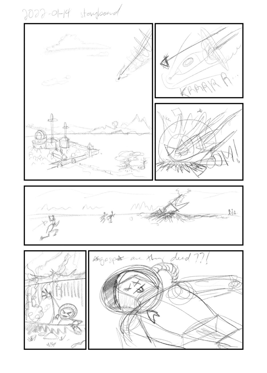
Page #1 storyboard
Resources
The How To Think When You Draw series was a very helpful jumpstart, in no particular order Cityscapes, Clouds, Details At Distance, Grass, Impact Debris, Junk Piles, Mountains, Pebbles and Gravel, Rocket Thrust, Running Figures, Smoke Effects, Space Helmets, Spaceships, Stick Figures, and last but not least The Horizon. I’ve drawn some of these things before, but it was nice to have a collected quick reference for so many topics close at hand.
For the cityscape and spaceship in particular, I did separate studies to try out or discover what the design for them should actually be.
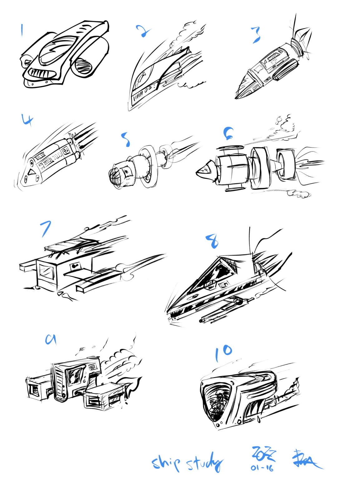
Ship study
For the ship design I settled on What if a Star Destroyer was smol?
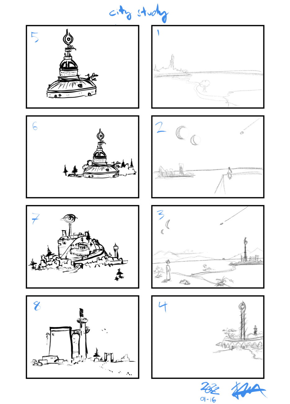
City study
I chose the one I thought had the strongest feel, even though the design wasn’t exactly what I was originally going for.
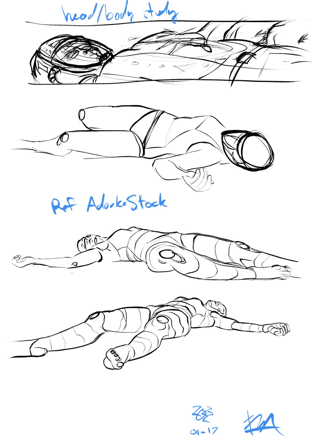
Pilot study
For the lying pilot figure, I did several studies and settled on one from a reference photo by AdorkaStock, and another random photo found by googling for the crawling pose.
For the smoke, explosion, and ship thruster effects I referred to Calvin & Hobbes (ie. Spaceman Spiff), and the One Piece manga.
Drawing a partial face, at a weird angle, inside of a helmet visor was harder than I had anticipated, and referred to the Dandadan manga for help here.
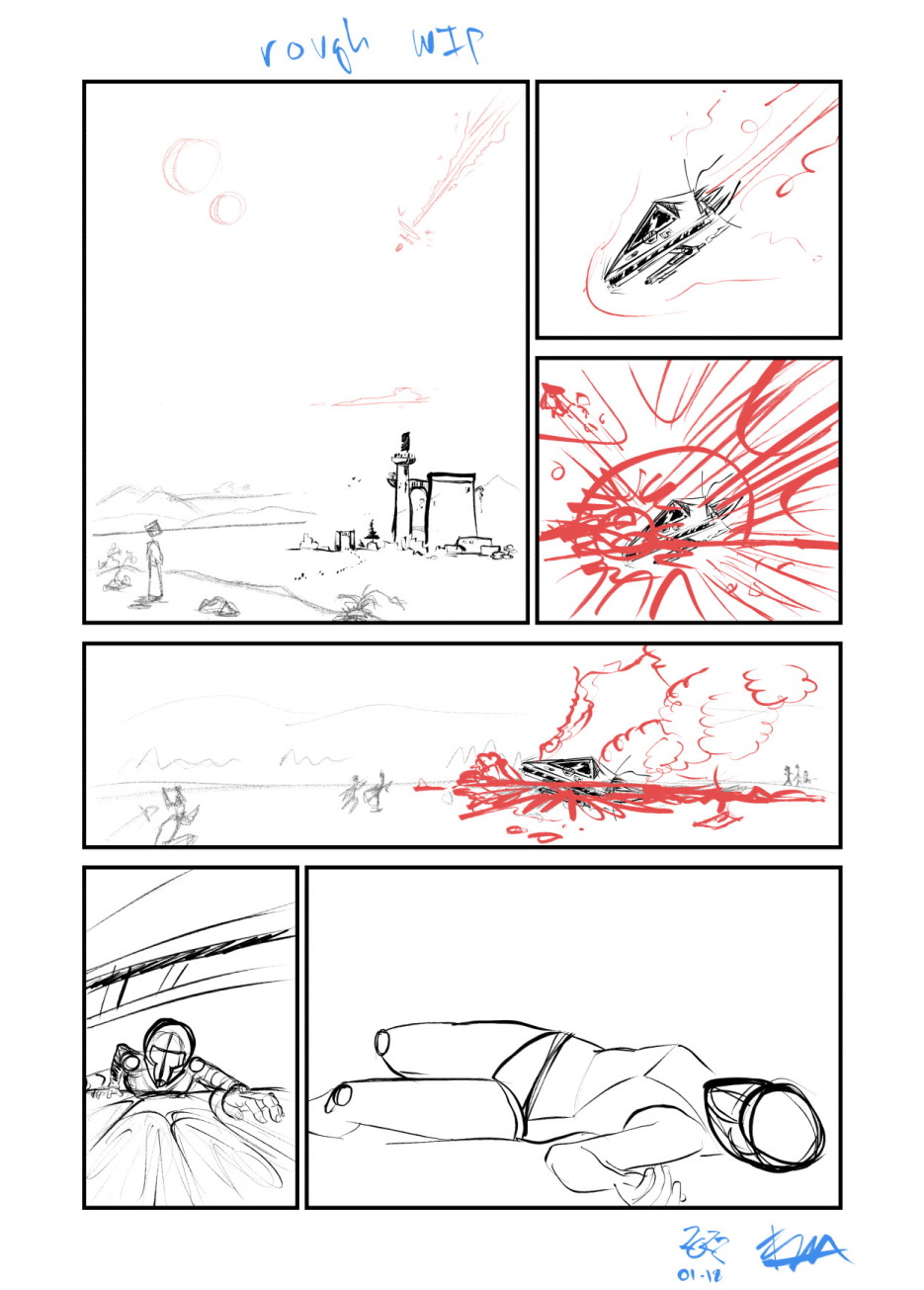
Rough work in progress
The Good and The Bad
Overall I’m very happy with how the first page turned out, I was prepared for it to be much worse :)
As for what I’d like to improve on:
- The smaller figures (pointing at the ship, and running to the crash site) are weak and don’t have strong gestures or form, surprisingly difficult to achieve on tiny shapes.
- I mostly didn’t know what to do with the ground at all in any panel, what does the ground look like!? I mostly settled for patterns here to fill the space, which may have been unnecessary.
- The crash site is mushy and not well defined, same with some of the smoke effects.
- The mountains could have perhaps used some additional definition, or maybe they’re fine the way they are.
- Generally being more intentional with the use of tones and patterns.
- I drew the pilot’s flight suit on the fly, and it probably would have benefited from a proper design study first.
The studies that I did do were incredibly helpful, and I will make an effort to be more intentional with character, costume and environment designs in the future.