Draw A Manga Page Every Week Challenge - Week #2
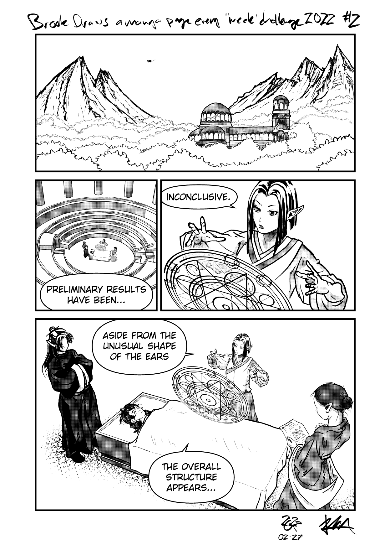
Page #2 In Review
The “week” in the challenge title is already increasingly aspirational instead of descriptive, as week #2 took an entire month.
I’m not happy with the pace, but better late than never! Several external factors conspired against my timeline somewhat, but mostly it came down to difficulty and motivation.

Page #2 final
Challenges
Coming off of the first page, there were several things I wanted to improve on or try for the first time.
- Better mountains and environmental establishing shot
- More detailed and intentional building exterior
- More figures, with improved features and clothing
- Improved perspective grounding of elements in each panel
- Try out Blender modelling and import for architectural/perspective work
And for the most part, I think I accomplished all of those things.
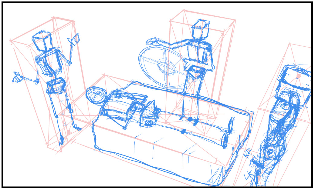
The final panel with 4 characters in 3-point perspective was (unsurprisingly) very challenging and I was stuck spinning my wheels here for quite a few days, not really knowing how to progress.

Couldn't this meeting have been an email, Pam?
My biggest mistake was trying to construct this scene without good references, and that is just something that’s beyond my ability for now. I finally relented, and spent the time searching for multiple pieces of reference that I could use to skew and manipulate into the correct perspective and hopefully have everything in the scene feel cohesive. Ultimately I’m quite happy with how this panel turned out, much to my relief.
Something to try in the future will be Clip Studio Paint’s 3D model posing functionality, which might also have served as a way to become unstuck with posing in this complicated perspective.

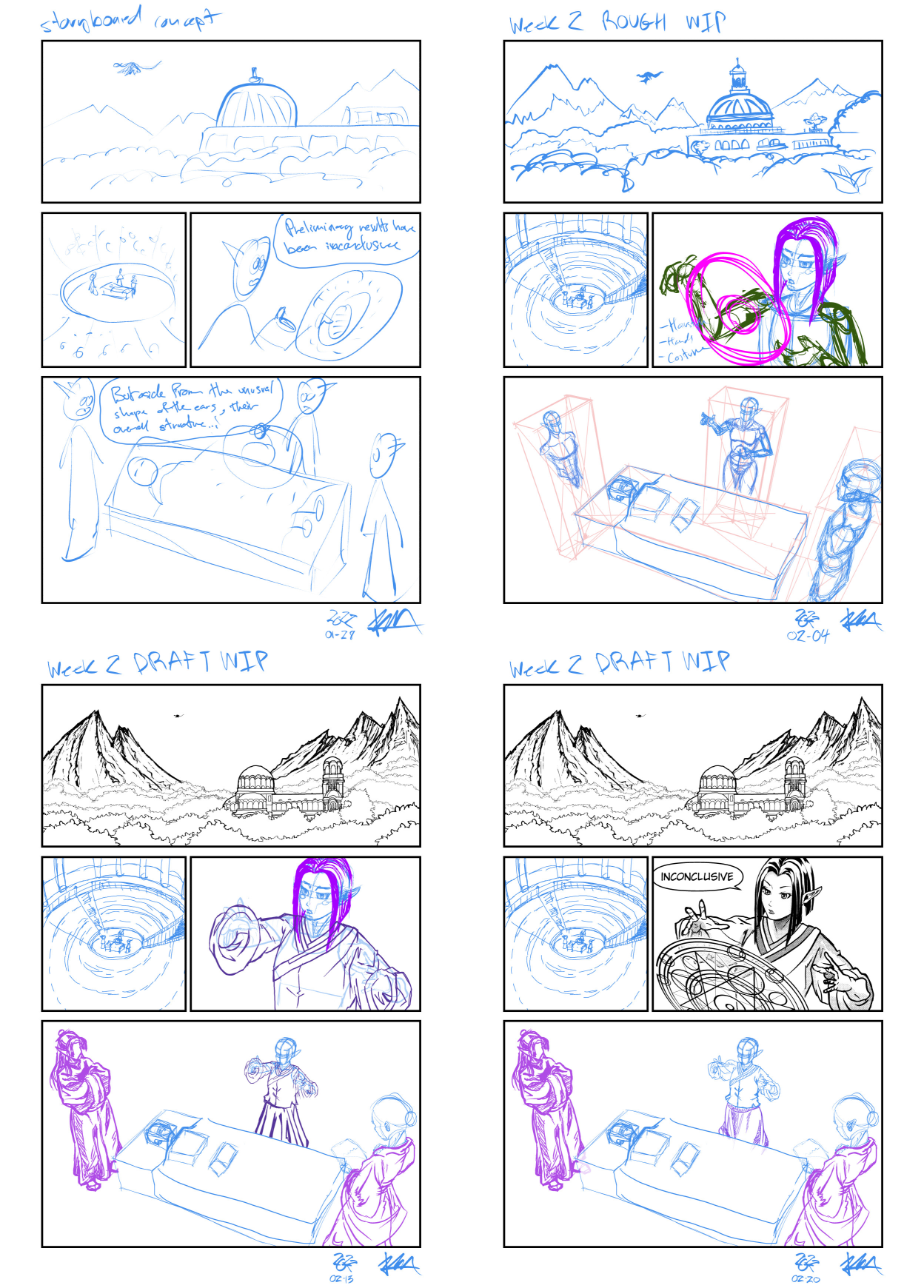
Progress...
Resources
I referred to the How To Think When You Draw series again mostly for help with the mountains.
The building exterior is based on Alexander Nevsky Cathedral in Sofia, Bulgaria. Everyone can appreciate a good basilica now and then.
The raised hands of the caster are based on a reference photo by AdorkaStock, and the person reading the sheet of paper is based on a pose from JookpubStock.
The character clothing designs are from The Apothecary Diaries, and I used Dandadan again as reference for the patient.